



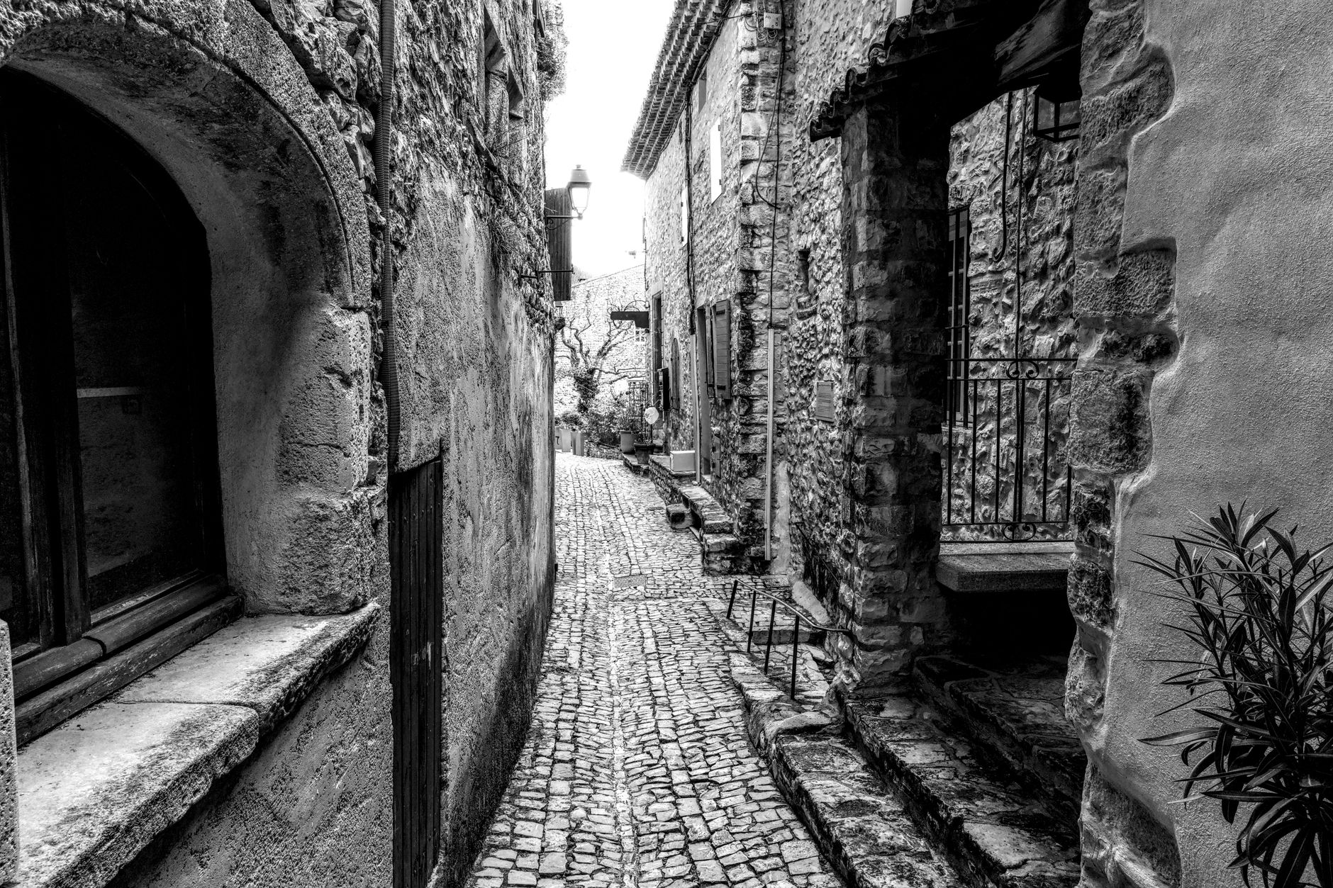
Photo by Jean-Paul Wettstein on Pexels
Travel photography is often a whirlwind of moments—sunrise over a mountain, a bustling market, a quiet café corner. When you return home, those images can feel disjointed, like a scrapbook without a thread. One of the most powerful ways to give your daily travel shots a unified narrative is to limit yourself to a four‑color palette. By consciously choosing and applying four hues throughout a trip, you turn random clicks into a visual story that feels intentional, cinematic, and unmistakably yours.
Why a Limited Palette Works
Human brains love patterns. When we see a series of images that share a common color language, we automatically group them together and assign meaning. A limited palette does three things:
- Creates cohesion. Even if the subjects differ—a street vendor, a lighthouse, a mountain trail—the shared hues bind them.
- Highlights mood. Warm oranges and reds evoke energy and adventure; cool blues and greens suggest calm and reflection.
- Guides the viewer’s eye. Consistent color cues lead the audience through your story without the distraction of clashing tones.
Consider the iconic Instagram feed of photographer Anna Le. She travels across Southeast Asia using a muted teal‑and‑mustard palette. Each post feels like a frame from the same film, and her audience instantly recognizes her visual signature.
Choosing Your Four Colors
Start with the environment you’ll be photographing. Look at the dominant natural tones—sky, water, foliage, stone—and decide which four will best represent the feeling you want to convey.
Step‑by‑step guide:
- Scout the location. Open the camera app and swipe through the live view. Notice the most prevalent colors.
- Pick a base hue. This is usually a neutral—soft gray, warm sand, or deep navy—that will appear in most shots.
- Add two accent colors. Choose one warm (e.g., burnt orange, rust) and one cool (e.g., teal, lavender) to create contrast.
- Select a highlight. A bright pop—like golden sunrise or vivid red door—gives you a visual “exclamation point.”
Real example: While exploring the historic town of Matera, Italy, I selected a palette of warm terracotta, muted olive, soft ivory, and deep indigo. The stone houses, olive trees, and twilight sky all fell naturally into those shades, making every frame feel like part of a single story.
Applying the Palette to Everyday Shots
Now that you have your colors, it’s time to weave them into each photo. You don’t need to force every hue into every frame; instead, aim for at least two of the four colors to appear in each image.
Techniques:
- Composition. Position a colored element—like a red umbrella or a teal door—so it becomes a focal point.
- Lighting. Shoot during golden hour for warm tones, or on overcast days for cooler, muted shades.
- Post‑processing. Use Lightroom’s HSL panel to subtly shift hues into your chosen palette. For example, push the “orange” slider slightly toward your warm accent color.
- Accessories. Carry a scarf, hat, or even a small prop that matches one of your palette colors. It’s an easy way to inject the hue without relying on the environment.
During a day in Kyoto, Japan, I used a palette of emerald green, soft pink, charcoal gray, and sunrise gold. A simple pink paper lantern in a narrow alley instantly gave the shot its pink accent, while the surrounding mossy stone walls supplied the emerald and charcoal. The final image felt like a deliberate composition rather than a spontaneous snap.
Storytelling Through Consistency
Consistency is the secret sauce that turns a series of photos into a narrative. Here’s how to maintain it from start to finish:
- Plan your story arc. Decide the emotional journey—excitement → contemplation → resolution—and match each phase with a dominant palette hue.
- Use a visual diary. Create a simple spreadsheet with columns for location, dominant colors, and notes. This helps you track which hues you’ve used and where you need to introduce the missing ones.
- Review daily. At the end of each day, select your best shots and check whether they meet the two‑color minimum. If not, reshoot a quick “fill‑in” shot—like a close‑up of a textured wall that matches the palette.
- Curate the final feed. When you upload to Instagram or a travel blog, arrange the images so the colors flow naturally. Alternate warm and cool images to keep the eye moving.
Example: On a week‑long trek through Patagonia, I began with icy blues and grays for the glacier days, shifted to earthy browns and burnt oranges for the forest trails, and finished with golden yellows for the sunrise on the mountain summit. The resulting photo series reads like a visual diary, each color marking a chapter of the adventure.
FAQ
Q1: What if the environment doesn’t naturally contain my chosen colors?
A: Use accessories or post‑processing to introduce the missing hues. A bright scarf, a painted sign, or a subtle HSL tweak can bring a color into the frame without feeling forced.
Q2: Can I change my palette mid‑trip?
A: Yes, but do it deliberately. Treat the change as a new chapter in your story. Announce the shift in your blog or caption so followers understand the visual transition.
Q3: How many photos should I aim to create with the same palette?
A: There’s no strict rule, but a minimum of 8‑12 consistent images usually provides enough material for a cohesive Instagram grid or a blog gallery.
By embracing a four‑color palette, you give everyday travel moments a visual language that speaks louder than words. The next time you pack your camera, bring a small color guide instead of a checklist of landmarks—and watch your photos tell one unforgettable story.
Found this helpful? Share it with fellow travelers! ✈️
0 comments:
Post a Comment